
Exterior painting requires suitable weather conditions to achieve a smooth, durable finish. Learn how temperature, humidity, rainfall, wind and sunlight...
Best Interior Paint Colours for Adelaide Homes
TABLE OF CONTENTS:
- Best Interior Paint Colours for Adelaide Homes
- How Adelaide Light Changes Interior Paint Colours
- 15 Best Interior Paint Colour Ideas
- Best Living Room Paint Colours
- Best Bedroom Paint Colours
- Best Neutral Paint Colours
- How Room Orientation Affects Paint Colour
- Warm vs Cool Interior Paint Colours
- Common Interior Painting Colour Mistakes
- Painters
- Frequently Asked Questions
Best Interior Paint Colours for Adelaide Homes
The best interior paint colour is not necessarily the colour that is currently trending.
A successful choice should work with the room’s natural light, existing materials and overall style.
For many Adelaide homes, versatile shades such as warm whites, soft neutrals, beige, greige, muted greens and soft blue-grey tones can provide a practical starting point.
However, even a neutral colour can look different from room to room.
For example, a warm white may look bright and balanced in a naturally lit living room but appear noticeably warmer in a darker hallway. A cool grey may feel crisp in a bright space but look colder in a room with limited natural light.
This is why choosing interior paint should involve more than looking at a colour chart.
Consider:
- How much natural light enters the room
- Which direction the windows face
- The colour of the flooring
- Existing furniture
- Curtains and blinds
- Kitchen cabinetry
- Stone and tile colours
- Ceiling colour
- Artificial lighting
- The size of the room
- The atmosphere you want to create
Should you choose a neutral colour?
Neutral colours remain popular because they are flexible.
They can work with different furniture styles and make it easier to change decorations later without repainting the entire room.
But neutral does not have to mean plain.
Warm beige, greige, taupe, soft cream and muted grey can all add character while remaining relatively easy to coordinate.
For homeowners preparing a property for sale or rental, versatile neutrals can also make a practical choice because they appeal to a broad range of people.
How Adelaide Light Changes Interior Paint Colours
One of the biggest mistakes homeowners make is choosing paint based only on how it looks on a small sample.
Paint colour is affected heavily by light.
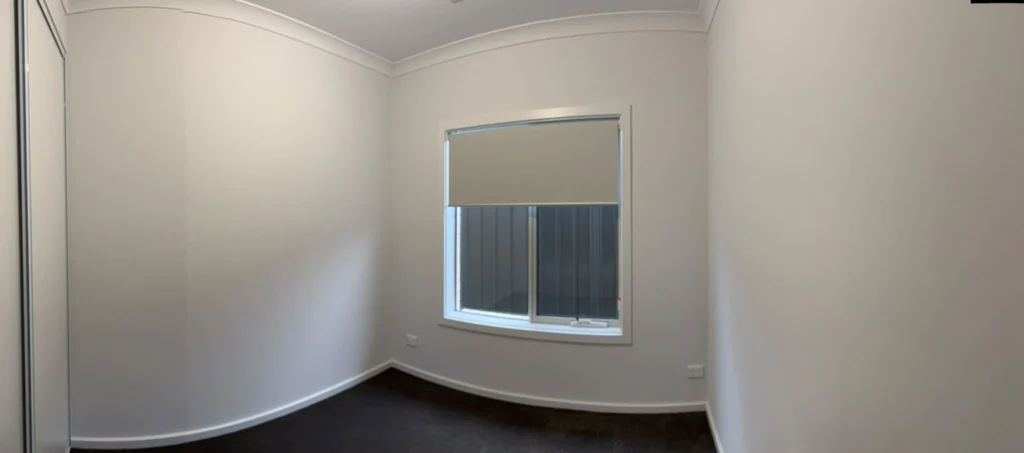
A room with large north-facing windows can look very different from a darker room with limited natural light. The same wall colour may also look different in the morning compared with late afternoon.
Artificial lighting adds another variable.
Warm household lighting can make some colours appear warmer, while cooler lighting can make certain whites and greys appear crisper.
Natural light matters
Before choosing your final colour, observe the room at different times of the day.
Ask yourself:
- Does the room receive direct sunlight?
- Is the room naturally bright?
- Does the colour look different in the morning?
- Does it become darker in the afternoon?
- Does the room rely heavily on artificial lighting?
- Are there trees or buildings outside the windows?
- Does the flooring reflect or absorb light?
These questions can prevent an expensive colour mistake.
Test colours in the actual room
A colour that looks excellent online may not produce the same result in your home.
Ideally, test your shortlisted colours on sample boards or suitable areas and observe them under both natural and artificial lighting.
This is particularly important when selecting white, beige, grey or other colours with subtle undertones.
15 Best Interior Paint Colour Ideas for Adelaide Homes
There is no universal best colour, but the following options can provide a useful starting point for Adelaide homeowners.
1. Warm White
Warm white is one of the most versatile options for residential interiors.
It can create a clean appearance without the stark feeling sometimes associated with very bright white.
Warm white can work particularly well in:
- Living rooms
- Hallways
- Open-plan spaces
- Kitchens
- Bedrooms
- Entry areas
It also provides a flexible background for timber, stone, fabric and darker furniture.
2. Soft Off-White
If you want a bright interior but don’t want an extremely crisp white, an off-white can be a practical alternative.
Soft off-whites can work well in homes with traditional, contemporary or transitional interiors.
The key is to check the undertone before committing.
Some off-whites lean warm, while others can have cooler or slightly grey undertones.
3. Light Beige
Beige has remained popular because it adds warmth without dominating a room.
A light beige can work especially well with:
- Timber flooring
- Cream furnishings
- Natural fabrics
- Warm lighting
- Traditional interiors
It can also be useful when a pure white feels too stark.
4. Greige
Greige combines elements of grey and beige.
It can be a useful option for contemporary homes because it provides more depth than a basic white while remaining relatively neutral.
Greige can work particularly well with:
- White trim
- Timber
- Stone
- Black fixtures
- Neutral furniture
However, always test the exact shade because greige can vary significantly between products.
5. Soft Grey
Soft grey can create a clean and contemporary appearance.
It works well when paired with white trim, timber flooring or darker furniture.
The main consideration is undertone.
Some greys can feel warm, while others appear distinctly cool.
In rooms with limited natural light, a very cool grey may feel colder than expected.
6. Soft Taupe
Taupe sits between several neutral colour families and can create a slightly richer appearance than pale beige.
It can work particularly well in:
- Bedrooms
- Living rooms
- Studies
- Dining rooms
Taupe can also complement natural timber and earthy materials.
7. Soft Sage Green
For homeowners who want more colour without using an intense shade, muted sage can be an attractive option.
Sage can work well with natural materials and can add subtle character to an otherwise neutral interior.
It can be considered for:
- Bedrooms
- Studies
- Living rooms
- Feature walls
8. Muted Blue
Blue can create a calm and comfortable atmosphere when the right shade is selected.
Soft or muted blues are generally easier to use across an entire room than very strong blue shades.
They can work particularly well in bedrooms, bathrooms and studies.
9. Dusty Blue-Grey
Blue-grey combines the cooler quality of blue with a more subdued appearance.
It can work well in modern homes and can pair with:
- White
- Light timber
- Grey furniture
- Natural fabrics
10. Warm Sand
Warm sand tones can create an earthy and comfortable interior.
They work particularly well with timber, stone and other natural materials.
This can be a good choice for homeowners who want something warmer than grey but less yellow than some traditional creams.
11. Soft Terracotta
Terracotta can bring warmth and personality into an interior.
Rather than covering every wall in a strong terracotta shade, consider using it selectively.
It may work as:
- A feature wall
- An accent area
- A study wall
- A dining room colour
12. Muted Olive
Muted olive can introduce a deeper natural tone without being as bright as some greens.
It can work well in rooms where you want more visual depth.
Pairing it with warm whites, timber and natural fabrics can create a balanced interior.
13. Charcoal
Charcoal is a dramatic option and should be used thoughtfully.
It can work particularly well for:
- Feature walls
- Studies
- Media rooms
- Selected bedrooms
Dark colours can make a room feel more enclosed, so consider the room’s size and natural light before choosing a deep shade.
14. Deep Navy
Deep navy can provide a strong contrast against white or warm neutral colours.
It can be particularly effective as a feature colour rather than being used throughout an entire home.
A navy feature wall can work well behind:
- Beds
- Television units
- Shelving
- Desks
15. Soft Cream
Cream can suit homeowners who prefer a warmer and more traditional interior.
It can work especially well with:
- Timber
- Traditional furniture
- Warm lighting
- Natural fabrics
As with white, cream shades have different undertones, so samples should be tested in the actual room.
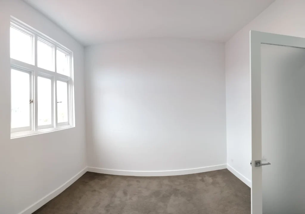
Best Living Room Paint Colours for Adelaide Homes
The living room is often one of the most important rooms when choosing interior paint ideas.
It is where family members spend time, guests are welcomed and furniture and decorative pieces need to work together.
For this reason, versatile colours are often a sensible choice.
Warm white for a flexible living room
Warm white can create a bright background without feeling overly clinical.
It can work with both modern and traditional furniture.
Greige for a modern living room
Greige can provide more depth while remaining neutral.
It works particularly well with timber, stone and black or dark furniture.
Soft beige for warmth
Beige can make a living room feel warmer and more comfortable.
It can be particularly effective where the furniture and flooring already have warm undertones.
Soft grey for a contemporary look
Soft grey can work well in modern interiors.
However, test the undertone before painting the entire room.
Muted green for character
A soft sage or muted green can add personality without becoming overpowering.
This can be particularly useful for homeowners who want something different from white, beige or grey.
Living room colour comparison
| Interior style | Colour direction |
|---|---|
| Modern | Greige, soft grey, warm white |
| Traditional | Cream, beige, warm white |
| Coastal | Soft white, muted blue |
| Natural | Sage, warm beige, taupe |
| Minimalist | Warm white, soft grey |
| Dramatic | Navy, charcoal |
| Transitional | Greige, taupe, soft beige |
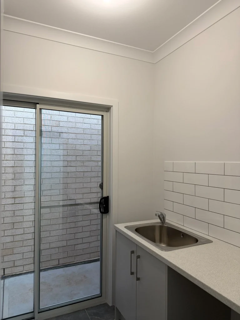
Best Bedroom Paint Colours
Bedrooms are usually better suited to colours that create a comfortable and relaxing visual environment.
The best bedroom paint colours are ultimately personal, but softer shades are often easier to live with than highly intense colours.
Warm white
A warm white can make the bedroom feel clean and simple while working with different bedding colours.
Soft beige
Beige can create a warm and comfortable appearance.
Muted blue
A subdued blue can add colour without becoming visually overwhelming.
Sage green
Soft sage can provide a natural appearance and pair well with timber furniture.
Soft taupe
Taupe adds more depth than a very pale neutral while remaining relatively versatile.
Dusty blue-grey
This can work well in contemporary bedrooms where homeowners want a subtle cooler tone.
Before choosing a bedroom colour, consider the existing wardrobe, bed frame, flooring, curtains and lighting.
A wall colour should work with the whole room rather than being selected in isolation.
Best Neutral Paint Colours for Adelaide Homes
Neutral colours are among the most practical choices for homeowners who want flexibility.
Popular neutral paint colours include:
- Warm white
- Off-white
- Cream
- Beige
- Greige
- Taupe
- Soft grey
Why neutral colours remain popular
Neutral walls can make it easier to:
- Change furniture
- Update decorations
- Add artwork
- Change curtains
- Introduce feature colours
- Prepare a home for sale
- Maintain a consistent colour scheme
However, choosing a neutral colour does not mean choosing the safest-looking colour available.
The undertone can make a major difference.
Understanding undertones
Two colours may look almost identical on a small sample but appear noticeably different across a large wall.
A white may have:
- Warm undertones
- Cool undertones
- Grey undertones
- Cream undertones
Similarly, beige can lean yellow, pink, grey or brown depending on the particular product.
This is why samples should be tested in your actual home.
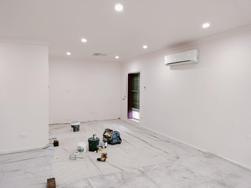
How Room Orientation Affects Paint Colour
The direction a room faces can influence how paint colour appears.
Natural light changes during the day, and this can affect the perceived warmth or coolness of a wall.
North-facing rooms
Depending on the home’s design and surrounding environment, these rooms can receive stronger natural light.
Warm neutrals and balanced whites can work well, but the exact result depends on the room.
South-facing rooms
Rooms receiving less direct sunlight may appear cooler or darker.
Warmer whites, beige, cream and warmer neutral colours can sometimes help create a more comfortable appearance.
East-facing rooms
Morning sunlight can make colours appear different earlier in the day than later.
West-facing rooms
Afternoon sunlight can create stronger warmth and brightness.
The important point is not to follow a rigid rule.
Instead, test your preferred colours in the actual room and observe them at different times.
Warm vs Cool Interior Paint Colours
Understanding warm and cool colours can make choosing interior paint much easier.
Warm colours
Examples include:
- Cream
- Beige
- Warm white
- Taupe
- Terracotta
- Some warm greens
Warm colours can create a comfortable and inviting atmosphere.
Cool colours
Examples include:
- Blue
- Blue-grey
- Cool grey
- Some green tones
Cool colours can create a cleaner or calmer appearance.
Neither group is automatically better.
The right choice depends on the rest of your home.
| Warm colours | Cool colours |
| Warm white | Cool white |
| Cream | Blue |
| Beige | Blue-grey |
| Taupe | Cool grey |
| Terracotta | Some green-blue shades |
Common Interior Painting Colour Mistakes
1. Choosing a colour from an online photograph
Screens can display colours differently.
A colour shown online should be treated as inspiration, not a guarantee of how it will look on your wall.
2. Ignoring undertones
This is particularly common with white, beige and grey.
A colour that appears neutral on a small sample may have a noticeable undertone once applied across a large wall.
3. Testing in only one location
A wall near a window may receive completely different lighting from a wall on the opposite side of the room.
4. Choosing a colour before considering the flooring
The floor is a major visual surface and can influence how the wall colour appears.
5. Using too many strong colours
Strong colours can be effective, but using several unrelated shades throughout an open-plan home can make the interior feel disjointed.
6. Following trends without considering the property
Popular colours change.
A colour should still suit your home, furniture and personal preferences.
7. Forgetting artificial lighting
A wall can look different under daylight and household lighting.
8. Painting without preparing the walls
Even the best paint colour will not look professional if the surface underneath it is damaged or poorly prepared.
Walls may require:
- Cleaning
- Filling
- Sanding
- Repairing
- Priming
- Sealing
before the finish coats are applied.
9. Buying paint before calculating the project properly
Coverage varies between products and surfaces.
Paint quantities should be calculated according to the product instructions, surface area and number of coats required.
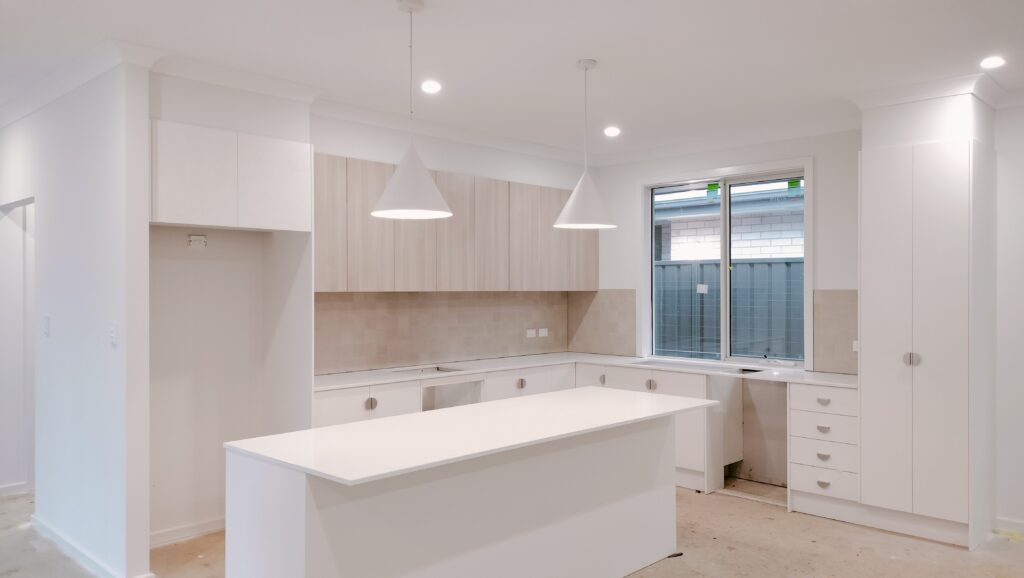
Painting Services From SA Prep and Paint
SA Prep and Paint Services Pty Ltd provides professional painting services for homes and businesses across Adelaide and nearby areas.
The business is located in Paralowie and provides services including:
- Residential painting
- Commercial painting
- Interior painting
- Exterior painting
- Wall painting
- Roof painting
- Complete home repainting
- Renovation painting
- Feature walls
If you’re repainting a single room or planning a larger project, the right preparation can make a significant difference to the final result.
SA Prep and Paint focuses on surface preparation, professional application, quality materials and clean work practices.
You can learn more about residential painting services in South Australia or view the company’s professional commercial painting services.
Planning an Interior Repaint in Adelaide?
If you’re unsure which paint colour will work with your existing flooring, furniture and lighting, getting professional advice before starting the project can save time and unnecessary repainting.
SA Prep and Paint can discuss your project, assess the surfaces and provide a quotation based on the work required.
Recent Posts
How to Prepare Walls for Painting: An Adelaide Homeowner’s Guide
Learn how to prepare walls for painting in Adelaide with simple steps for cleaning, repairing, sanding and priming surfaces to...
How to Choose the Right Paint Finish for Every Room in Your Adelaide Home
Learn how to choose the right paint finish for every room in your Adelaide home, from living rooms and bedrooms...
Interior vs Exterior Paint: What Adelaide Homeowners Need to Know
Learn the key differences between interior and exterior paint, including durability, weather resistance, finishes and surface requirements. Discover how Adelaide...
+61 470 480 710
Contact and Whatsapp
saprepandpaintservices@outlook.com
contact us, we are available 24/7
Frequently Asked Questions
How often should you paint your house?
Many homeowners consider repainting exterior surfaces approximately every 7–10 years, but the actual timeframe depends on the surface, paint system, preparation, exposure and condition of the existing coating.
How often should you repaint the interior of your house?
Interior walls can often remain in good condition for several years, but high-traffic rooms may need repainting sooner because of scuffs, marks, cleaning and everyday use.
How do I know if my house needs repainting?
Common signs include fading, peeling, cracking, bubbling, chalking, stains, exposed surfaces and an increasingly worn appearance.
Does Adelaide weather affect exterior paint?
Yes. Sunlight, heat, wind, dust and rain can gradually affect exterior coatings. The level of impact depends on the property’s exposure and the condition of the existing paint.
Can I paint over old paint?
It depends on the condition of the existing coating. Stable, well-prepared paint may be suitable for repainting, while loose, peeling or unstable coatings need to be properly prepared first.